Design Decisions Made Visible - Five Days With Gregor Lersch
In August, Gregor Lersch spent five days with us in Sydney: a sketching day called From Line to Design, the Sources and Systems symposium, and three days of hands-on work in New From Known, built around his theory of Linking. Across the five days, the formats and groups changed, but one idea kept returning: designers benefit from recognising the choices within a design and making those choices deliberately.
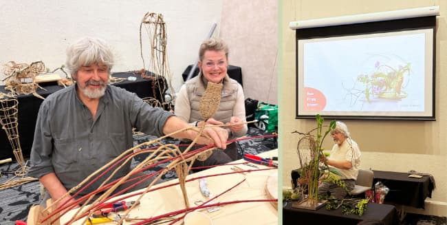
This was clearest during the sketching day. Ten designers worked with the same collection of materials, but each proposed something different. Before anyone handled a stem, they developed their ideas through drawing. Gregor then reviewed the sketches, selected one and constructed it.
Sketching introduced a useful separation between conceiving a design and making it. It exposed decisions that can otherwise disappear into the physical familiarity of working with materials. Line, placement, proportion and relationship had to be considered before habitual hand movements could take over.
|
|
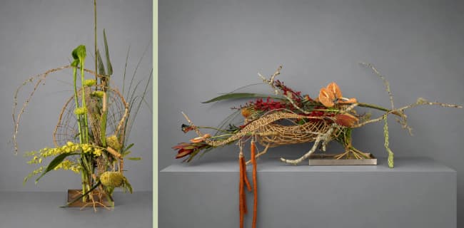
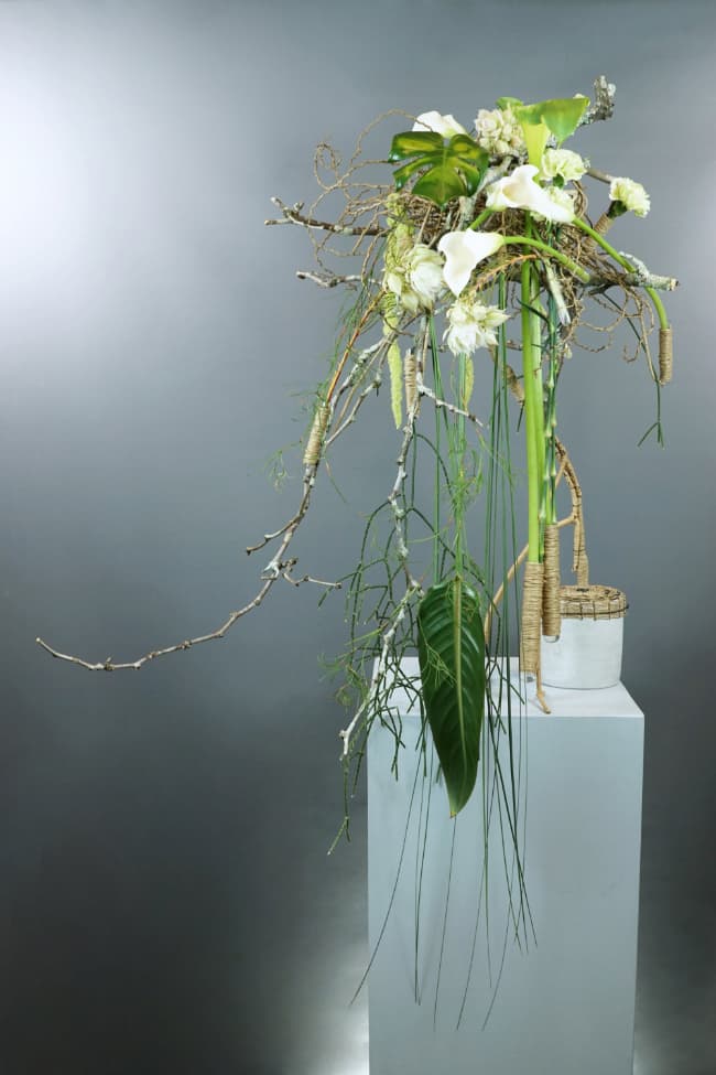
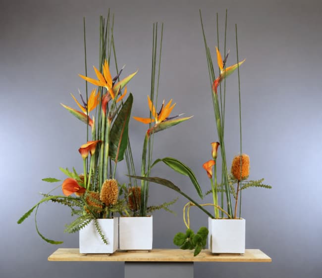
Linking, demonstrated here in two design examples from the New From Known workshop - starting with two floral concepts or styles and amalgamating them to generate a fresh concept.
|
|
Something similar happened when Gregor demonstrated what he calls Designing Out Loud. As he worked, he explained the decisions behind the developing form. The value was not simply in seeing how he made a design. It was in seeing that the design remained open to evaluation as it developed. Each choice affected what became possible next.
Gregor’s interest in the materials themselves was equally evident. Surrounded by Australian native flowers and foliage, he would occasionally hold up a stem and offer one euro to whoever could identify its genus or family. The wager brought some humour to the room, but the question was serious: what are we actually working with, and how closely have we looked?
Across all three activities, Gregor kept asking designers to look more closely: at the idea before making, at the decisions made during construction, and at the materials themselves. Each activity gave participants something specific to examine and discuss. Together, they demonstrated an approach that did not require every decision to be fixed in advance. It reminded us to pay close attention to the material, the developing work and the consequences of each choice.
|
|
Gregor and his best assistant, and wife, Gabi, mid preparations and presentation at Connections 2026 in Sydney
|
|
Design of the Month - September
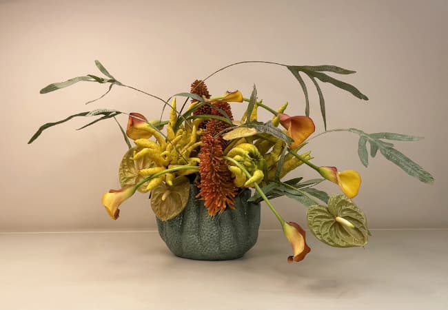
Repetition is a very useful tool in creating effective rhythm and harmony in a floral design. In our September Design of the Month, Sydney Designer and Teacher, David Berger, has utilised the power of repetition, not just with colour and line, but especially with form. David’s container, a core choice for his participation in our One Container Five Elements program, had an unusual organic and marine-like quality, with a bulbous base and numerous tentacle or finger-like openings at the top. David uncovered the perfect botanical repetition of form in Buddha’s Hand fruits (Citrus medica var. sarcodactylis). Nestling the fruits into the heart of the composition David created a clever visual connection back to the container’s figure.
|
|
Zantedeschia and Phlebodium leaves float away from a dense central area composed of multiple sculptural forms. The form of the marine-like container (bottom left) is visually connected to the design with the use of Buddha’s Hand fruits (bottom right).
|
|
Is There a Rule for Container Size in a Displacement Design? |
|
The short answer is no. Like all contemporary designs that incorporate a container, it depends on the scale and proportion of the container in relation to the design.
Scale is about size. The container, or each container if you’re using several, sits in comparison to the other elements in the design: the framework, the flowers, any accessories.
Proportion is different. It’s about the visual volume and weight of the container relative to the other volumes in the design, and relative to the overall volume the design occupies in three dimensions.
A container’s visual weight comes from the elements of design: its lines, its colour, its texture, its form, its mass and the space around it. How these work together affects how much weight and value the container carries. This is true of almost every design, but it matters particularly in displacement designs.
Here’s what I’d keep in mind, not just for contemporary work but for any design: rules about proportion have no absolutes. The guidelines we’re taught early on are starting points, not fixed limits.
When I first learned to make a vertical line design, I was taught that the height of the arrangement should be one and a half to two times the height of the container. I followed that rule closely at first. As I experimented with different containers and design styles, I found far more possibilities than that narrow range allowed.
|
|
Displacement design incorporating a container small in scale relative to the overall composition.
|
|
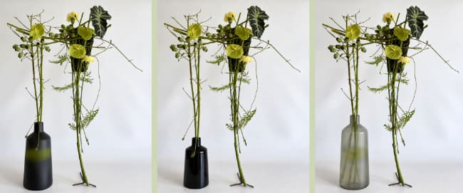
A large, pale, soft-textured container, even a translucent one that seems to disappear, can work in one design. A small, sharply geometric container in a deep, shiny colour can work in the same composition. Containers at either end of that range can carry equal impact in a design of similar size. |
|
I created the above displacement design (left) for a Floral Art New Zealand project a few years ago. The centre and right images have been edited with smaller and larger containers, respectively. Notice how the size and elements of each vase are different, yet each design works.
There’s no fixed rule for container size in a displacement design.
What matters is the container’s visual qualities and how they interact with the rest of your choices. Displacement designs, with their extreme asymmetry, are the ideal place to experiment with container size and see what those possibilities actually look like.
|
|
Competition Is Not the Only Place It Matters
Winning is an obvious measure of success in a floral competition. It matters, and for most competitors it is naturally part of the ambition. But it is not the only useful result. A competition also gives us an opportunity to practise, to test our skills and to learn more about the way we design.
Every competition begins with a particular situation. The schedule tells us what we are being asked to make, where and how the finished work will be seen, which restrictions apply and how the result will be assessed. A theme may capture our imagination first, but it is only one part of the design problem.
The remaining conditions turn that initial idea into a series of decisions. Does the scale suit the allocated space? Will the design be viewed from the front or from several directions? How should supplied staging or materials be incorporated? Which techniques are appropriate within the available time? The conditions do not usually provide a single answer. They identify the matters that need to be considered before we can arrive at our own answer.
|
|
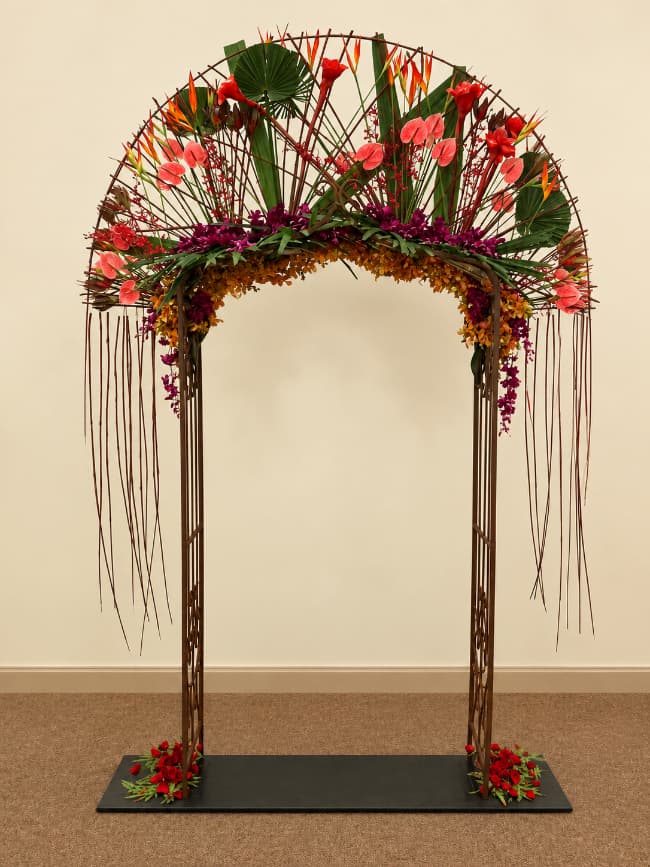
A large-scale entry arch I created with provided materials for the Interflora Australia Cup Competition, 2012.
The theme was ‘A Bollywood Wedding’.
|
|
The marking criteria then ask us to look beyond the appeal of the idea itself. A clever interpretation will not necessarily compensate for uncertain proportions, unresolved colour, unsuitable materials or poor finish. Equally, a sophisticated technique does not automatically add value if it is not accomplished well. We have to consider how interpretation, design, colour and workmanship operate together, and where our attention is best directed.
This process can be useful even when the official result is disappointing. By reviewing the judges’ comments and marks, and by looking at the finished work with some distance, we can begin to separate the decisions that succeeded from those that need more attention. What did the design communicate first? Did it belong in its intended setting? Which changes would improve its balance, rhythm, scale or cohesion? Learning from competition depends upon asking these questions, rather than simply recording where the entry was placed.
The same questions remain useful when we design for an exhibition, a client, an event or ourselves. Those situations also have a purpose, context, limitations and audience, even when they are not written down in a formal schedule. Competition makes these considerations explicit and gives us a structured opportunity to examine their effects.
Winning remains a worthwhile objective. But in my experience, as a competitor and as a judge, we gain the most when we can carry what we’ve learnt into the next competition. On Monday 21 September, I’ll share how I work to maximise both my score and what I learn from every competition.
Top Tips for Competition Success is a free 45-minute talk offering practical ways to approach that process more consistently.
7.30 pm New York time 11 am London time 6 pm Sydney time.
Join the live session that suits you, or join all three for fresh questions and a different conversation each time.
You can get your free invitation here.
|
|
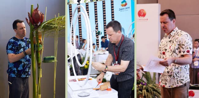
Mid-task shots from the Beijing World Flower Art Contest - (left) ‘My Beautiful Homeland’ Designers Choice Display, (middle) Moon-themed surprise task and (right) reading the schedule for the Beijing-theme surprise task.
Design: - Mark Pampling; Photography - Courtesy of World Flower Art Contest 2019
|
|
That is September. My thanks to David Berger for allowing us to feature his design. And, of course, heartfelt thanks to Gregor and Gabi for bringing their love of Floral Design all the way to Australia.
A reminder - if you have missed a previous newsletter, you can catch up with all the back issues at flowerthinking.com.
Thanks for reading this edition of Flower Thoughts. Until next month, keep designing and creating.
|
|
Design Theory as a source of inspiration: an example from our Connections 2026 Symposium in Sydney, illustrating how design theory can be a source of creative inspiration,
|
|
|
|
|