One Container, Five Elements
See Course Dates
Lead by Mark Pampling, Master Florist
An online course in five practical tasks and six online sessions
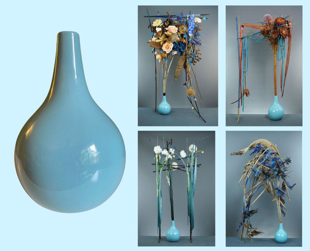
Choose any single container and go on an in-depth exploration of five different elements of design.
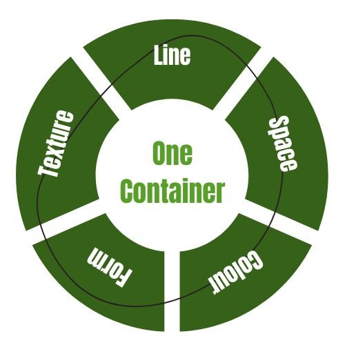
You will analyse your chosen container in terms of the elements of Line, Colour, Texture, Form and Space.
In each of five different design tasks, you'll examine and respond to each one of the elements as it relates to your container.
Using the principles of design to guide our attention, we will improve the choices we make in our process, together.
One Container, Five Elements expanded my design processes and choices. Analysing the container and looking for a link to each of the five elements. Focusing on one element was a disciplined journey, one that became more complex the further I travelled along the path, albeit a rewarding journey. On reflection it allowed me to consider my choices and to give each element of design a voice in my arrangements. I likened it to a choir where one voice may lead but if the supporting harmonies are not in pitch the whole auditory experience is not quite right. I found myself falling to my favourite elements and constantly self-evaluating to see what was often needed, often editing rather than adding. During the group feedback sessions, I gained new eyes not only on my own work but that of my peers. Such a rewarding experience.
This course is totally fabulous, taking one container and working with that in totally different ways with the focus on each of the Elements of design really make you think. Using the container as a starting point for inspiration but then pushing it on alternative ways is most refreshing. Mark's feedback and guidance throughout is so clear and well thought out and is delivered both verbally and in writing. This course is a great opportunity to learn from a master... But it is also self lead in that you choose your own design and work to stretch yourself in what ever way you like. So good I am considering a second round using different container.
I was extremely fortunate to be gifted the opportunity to partake in one of Marks courses. While I found the course challenging, I have learnt enormously from those challenges. The One Container, Five Elements course certainly gave me a new awareness of all the elements of designs and to consider them all when designing. I would unreservedly recommend this course if you have a passion for ongoing learning in your floral design.
Having completed the one container five elements course I would highly recommend this type of online learning to others. I really enjoyed the assignments and it was great to have something specific to work on. Each assignment was clearly defined and the feedback provided on everyone's work was clear with exciting suggestions made by Mark on how to improve the design or how it could be developed to become a showstopper. Everyone was encouraged to work freely on their own design ideas and supported through the process. Having access to both written feedback and the recording of the call ensures that everyone can connect and learn. I can't wait to work out which course I should join next.
One Container - Five Ways - what a way to get me interested and what a way to really understand all the elements and how by focusing on each you can create such different designs! Thank you Mark - learning little and big things every time.
In One Container Five Elements , participants' designs are shared and discussed through the lens of various designs principles. These discussions are conducted to be supportive and constructive, offering feedback, insight and encouragement. The goal is for all participants to finish with a sense of increased design confidence.
Let's take a tour, to understand how One Container Five Elements works, what kind of hands on work and feedback are involved, as well as the kind of learnings we can expect to attain.
Your Container + Line from a One Container, Five Elements session
-

Container Analysis - Line (Mark)
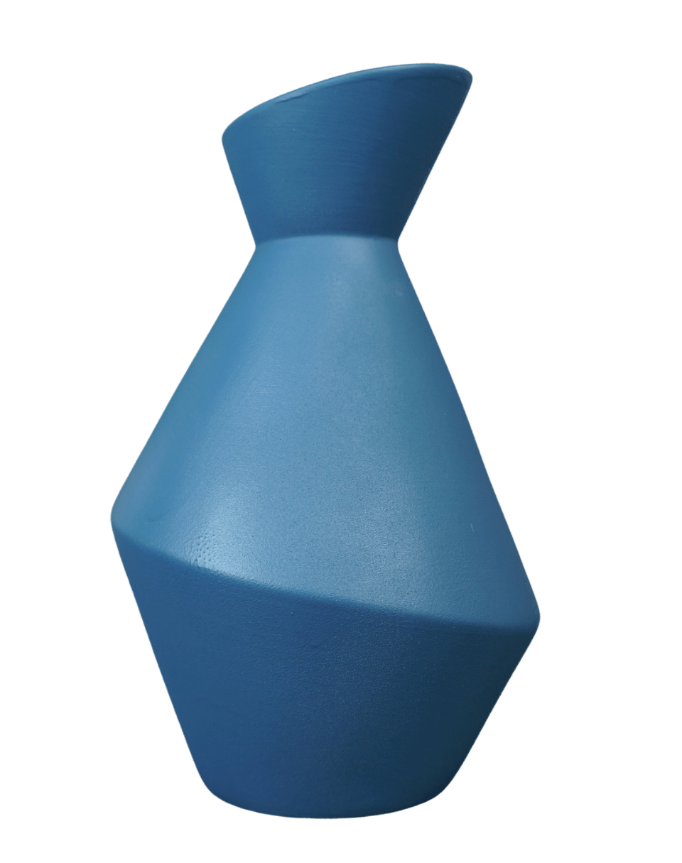
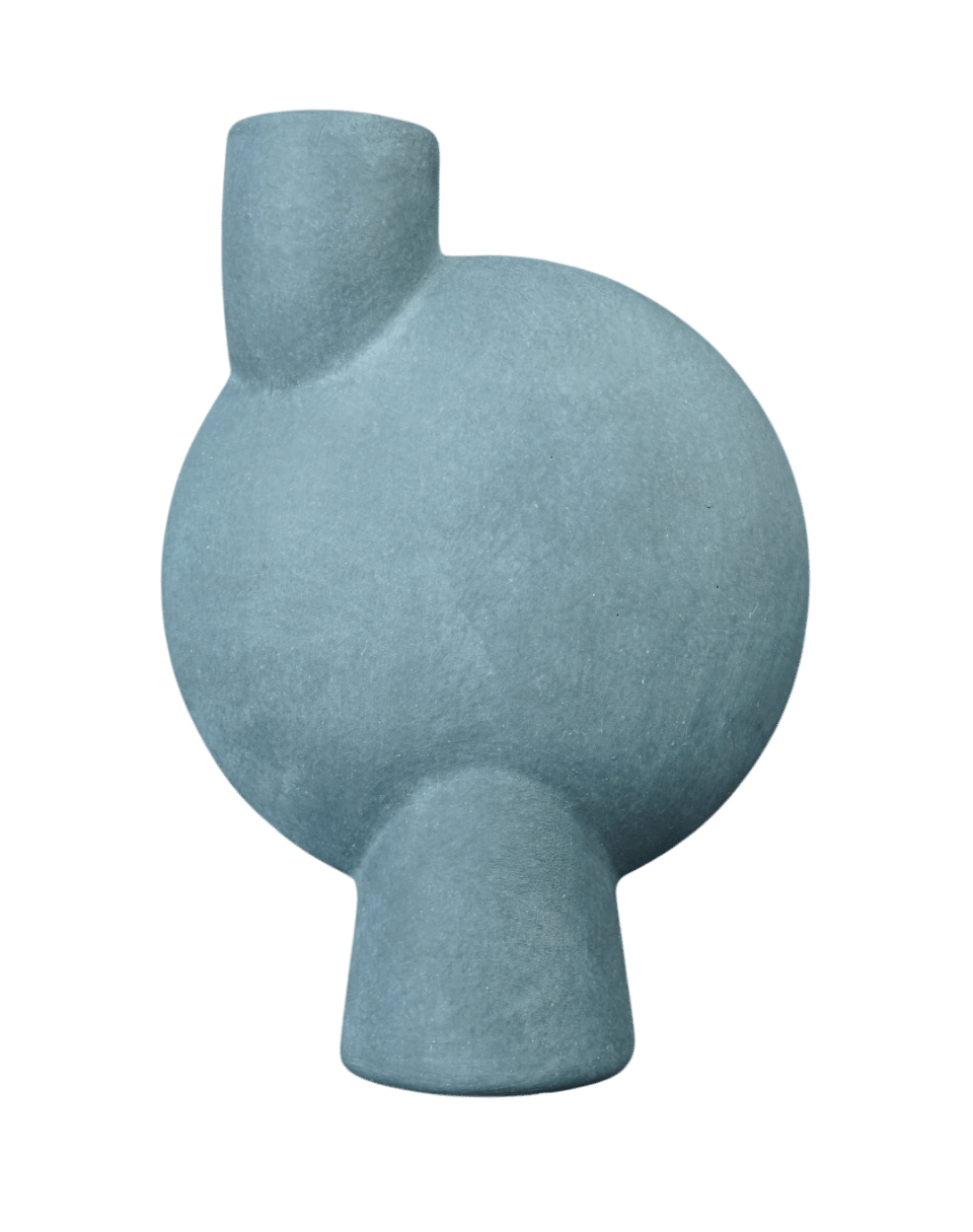
This container looks asymmetrical, when you first look at it, and it kind of is, but closer examination shows the axis is centrally placed. The lip of the vase and the widest lower circular part of the are two circles on different angles. But they they rotate around a single central axis in the design.
So it's a fairly simple container with a symmetrical central axis, but it has an asymmetrical feeling overall. It's made up of both curved and straight lines - the curved lines of the mouth and the body of the vase, the neck and the base but it also has the straight lines between those curves when viewed in profile.
-

Example Design - Line (Mark)
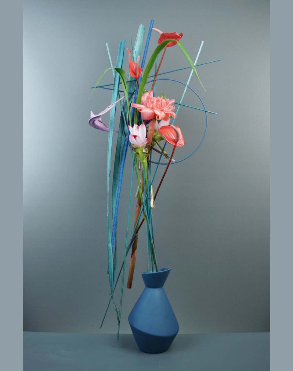
So I worked with a combination of curved and straight lines, and particularly featured a circular line with that blue ring around the main focal area and then surrounded that by some very straight lines so that I had the same combination of lines above the container as I did in the bottom.I also extended the the central vertical axis and made it made the whole composition have a vertical axis as well, so that the height was the most dominant dimension of the design.
-

Container Analysis - Line (Sharon, Participant)
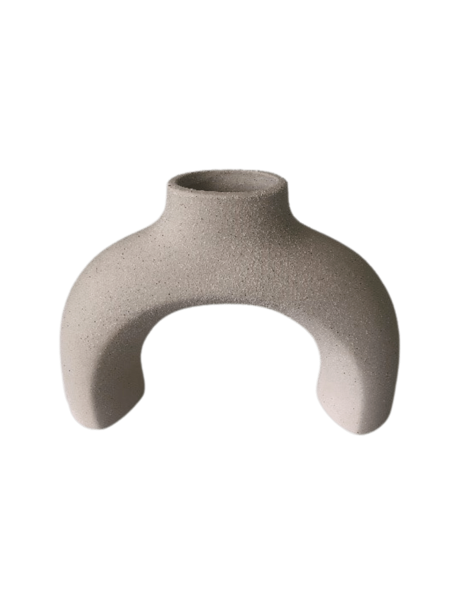
This container, Sharon describes has having a downward direction, yet the mouth leads your eye upward. A contrast between upward movement and downward movement, so the challenge becomes making one more dominant, to make it feel decidedly upward or downward.
I'm left with the impression that there’s more of an upward directed energy because you have the opening at the top, it starts with a very solid base, even though it's got a void in the center, but it starts with those solid arms touching the ground.
And then you have this underpinning at the top, but perhaps it depends on the perspective that you are seeing it from.
-

Example design - Line (Sharon, Participant)
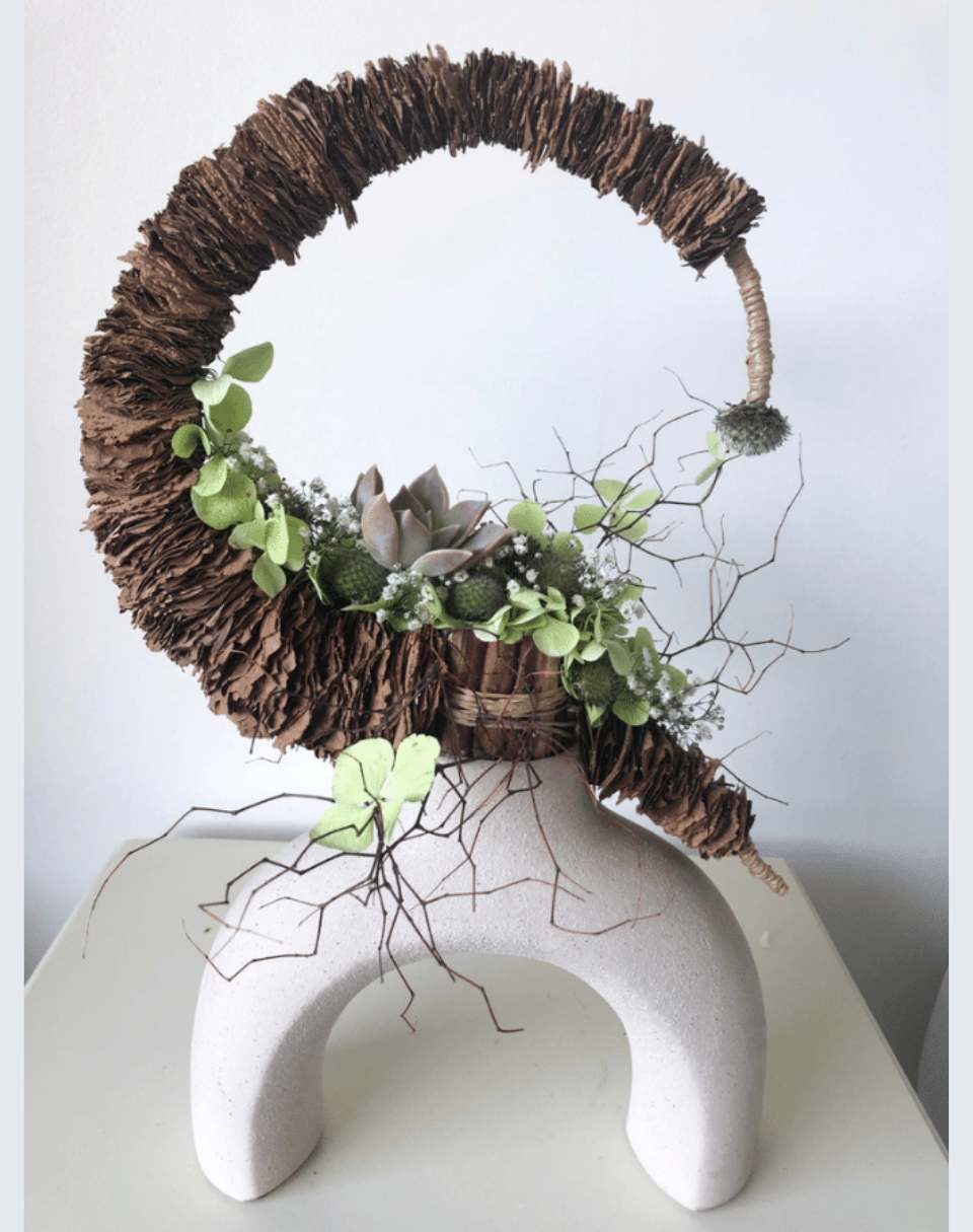
Sharon chose to work with those curved lines and to make a structure, then followed or embraced the curving line as well.
And instead of a half circle, like the container, made it a three quarter circle with extensions on the end, and to position on top of the mouth of the container, I can see that it would have been quite the technical challenge.
So the design has exceptionally decisive dimensions overall. So particularly between the width and the depth overall. It feels very shallow, particularly because it has a very strong or dense centre when you look at it from the side from the profile.
Your Container + Colour from a One Container, Five Elements session
-

Container Analysis - Colour (Kat, Participant)
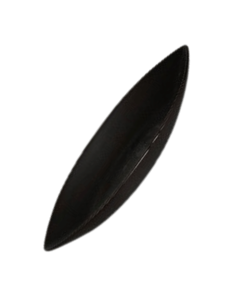
These matte satin black containers could have a fairly minimal impact if used with other neutral colours, but Kat has decided to go in the opposite direction and use a strong contrast against them.
Overall, the colour scheme can be identified as either monochromatic if you accept black as a colour, or you could simply say that they are neutral.
For me, you have to consider that the black is an important part of the design, if that is the only colour that you can identify in them. And even if you describe it as a neutral or a chromatic or an or chromatic, it still needs to be well considered in the final composition.
And the simplicity of the form along with the colour and texture gives it a more contemporary feeling.
-

Example Design - Colour (Kat, Participant)
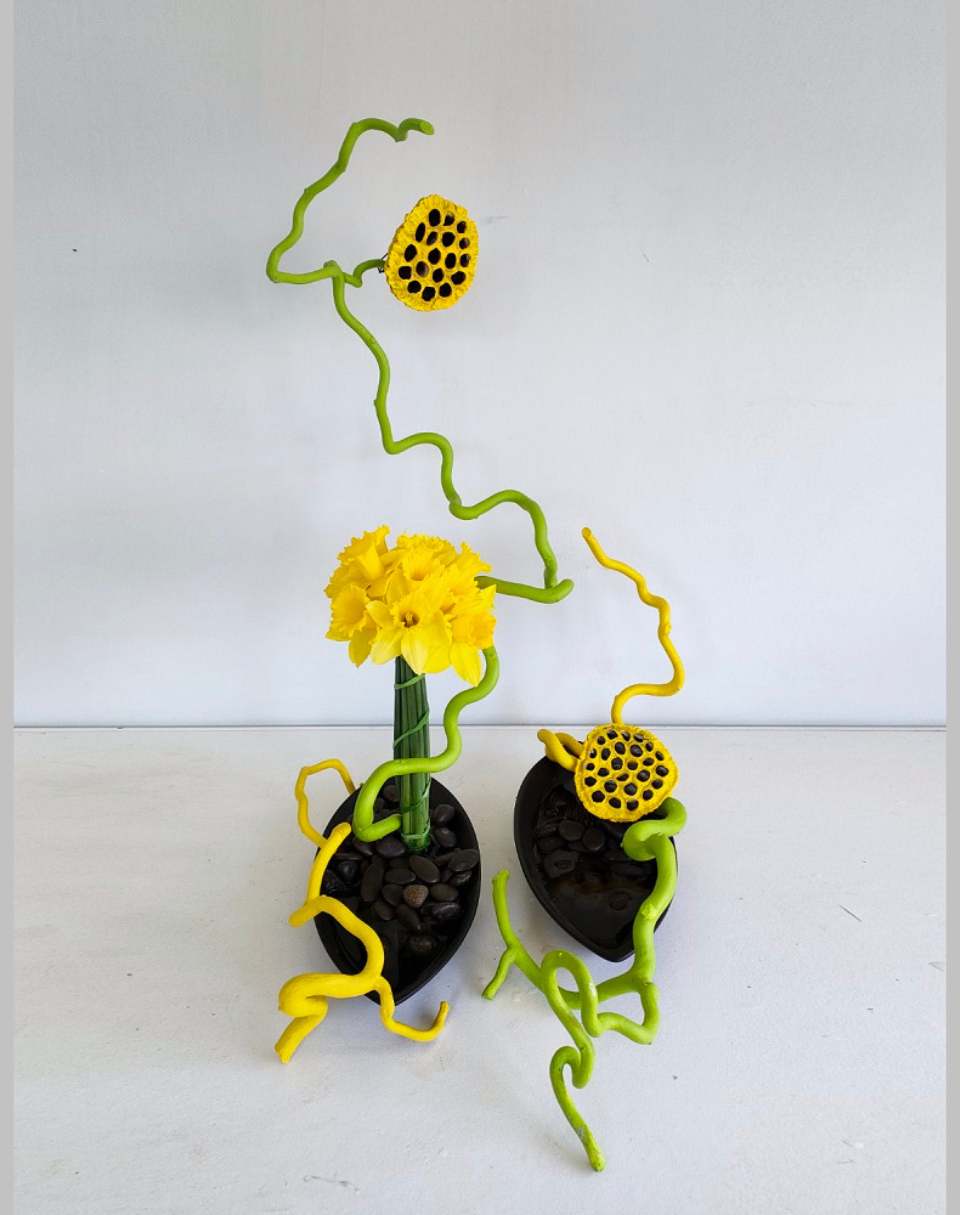
A fantastic example of using less material variety and using very strong colour contrast: it's often difficult to use less materials. It has worked fairly well here overall.
I wouldn’t change much about this design because the rhythm is good overall and the use of colour helps move the eye around.
Potentially, one could build up the grouping of the daffodils because, even though they are grouped together, and form one solid mass, larger than the the Lotus pods, the overall definition of that grouping is not quite as strong as the form and the colour contrast of the Lotus pods because you also have to contend with the colour contrast of the black holes in the lotus pod with that very definite outline that they have as well.
-

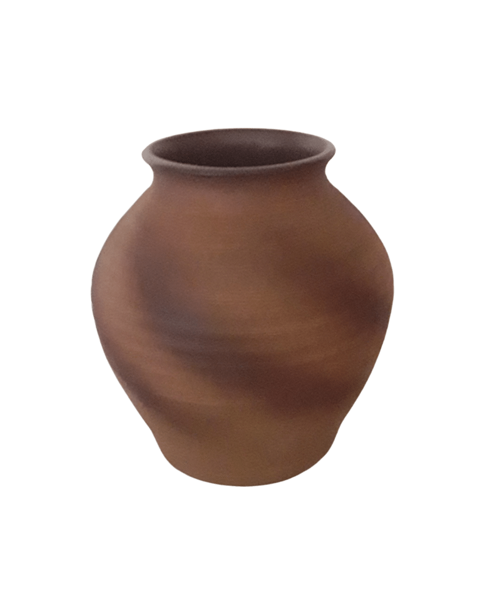
Container Analysis - Colour (Mark)
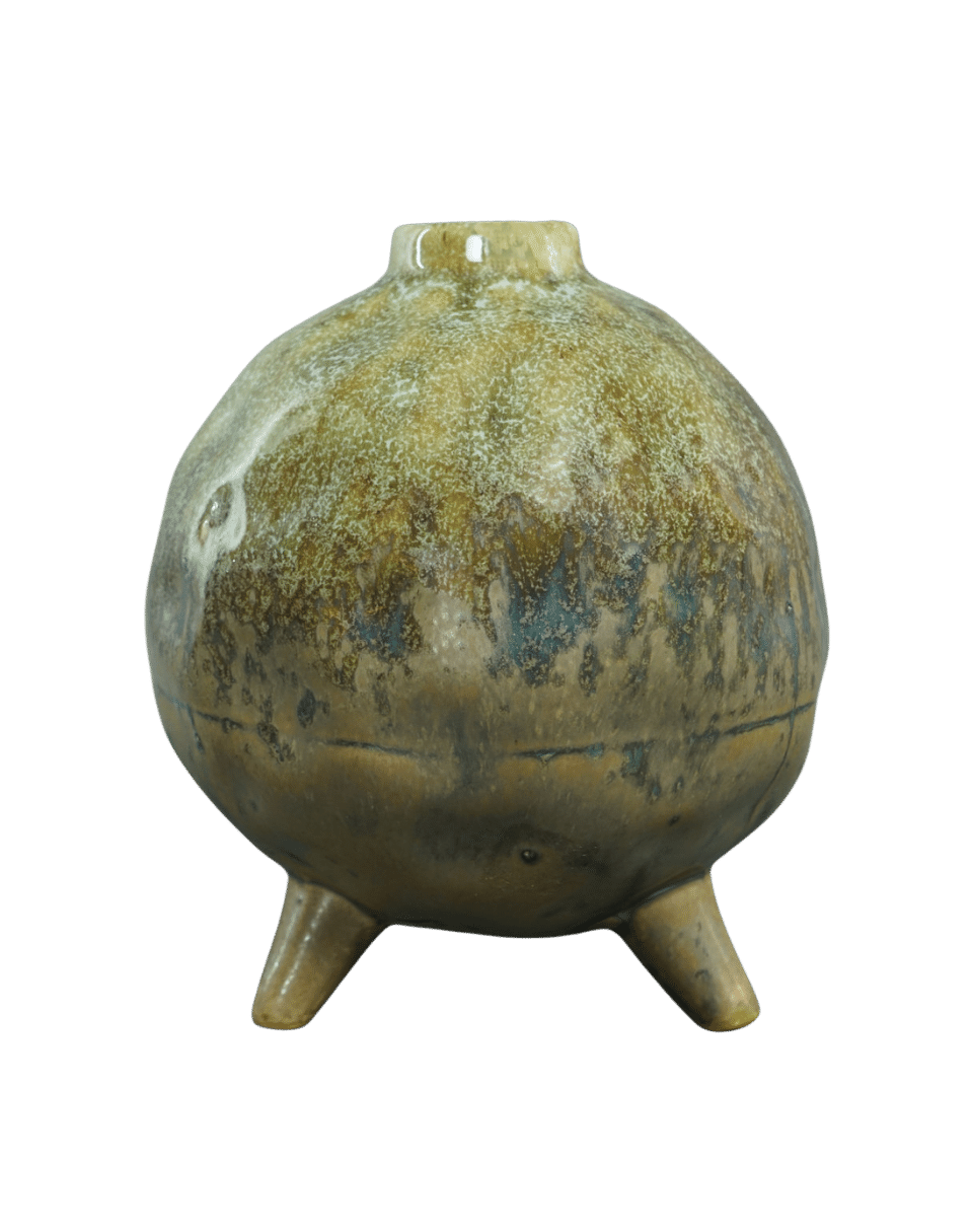
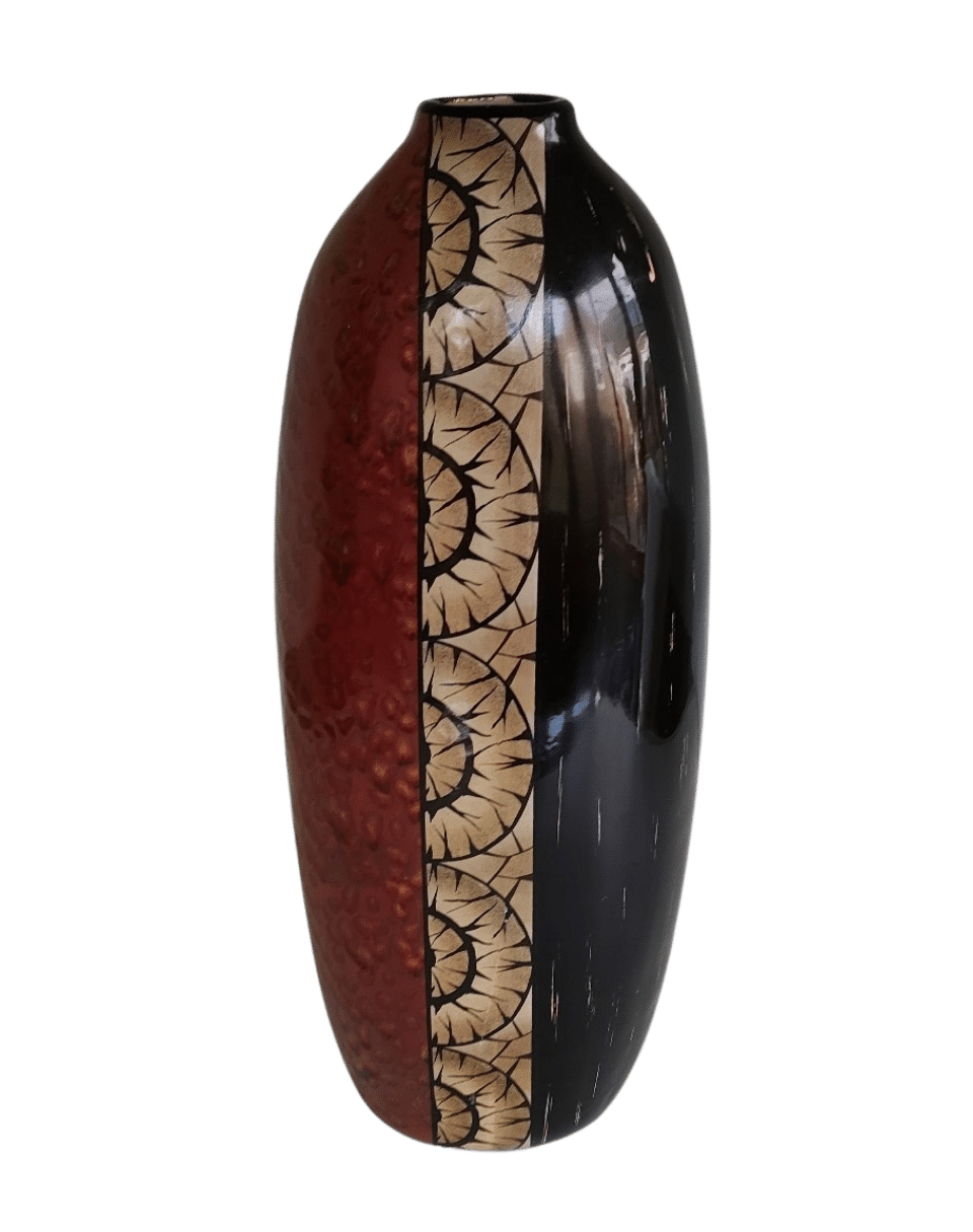
This container stumped me to begin with, because it seemed like it had lots of potential with all these greens and brown, so I could take it in any direction that I wanted.
But when I started to add colours to it, I couldn't really find a relationship with the container's colours.
So rather than fight against it, I decided to work with it. And I started searching for materials that simply had more of the same colours - that plucked out the greens and the browns in the container and extended them up into the composition.
-

Example Design - Colour (Mark)
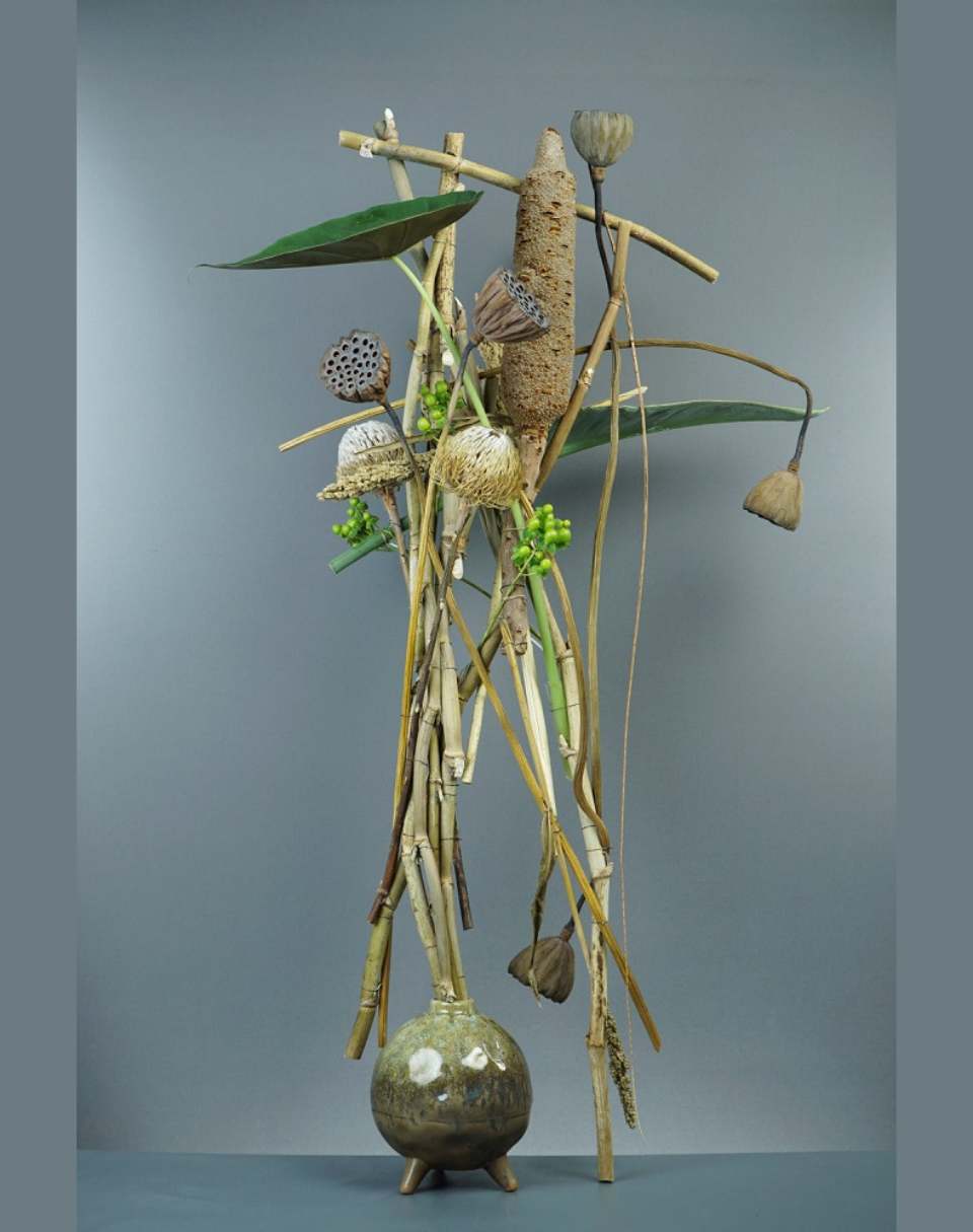
The dried lotus pods and the large Banksia pod in the top brought out all the different shades of brown. Looking at the dried or semi dried Baxteri Banksias, they had some of that muted green.
Just to contrast against that, and to add a sense of vitality, I added the bright green Hypericum berries and tucked them around other dried materials, then added two other fresh leaves in again as a strong contrast to all the mostly other dried muted colours.
The large Alocasia leaf on the top left hand side and the almost horizontal Strelitzia leaf that sits behind the Banksia and faces towards the upper right hand side.
So, essentially I simply expanded on the colour schemes in the container.
Comprehensive instructions, tips and explanations are given for every exercise:
Your Container + Texture from a One Container, Five Elements session
-

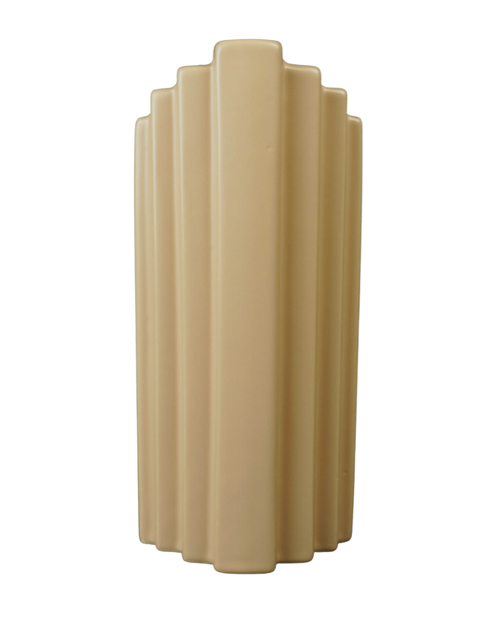
Container Analysis - Texture (Marlene, Participant)
Texture surface on container is smooth, evenly distributed. Visual texture of horizontal lines is like sandpaper, with coloured overlaying lines looking smooth, so the contrast is mild.
-

Example Design - Texture (Marlene, Participant)
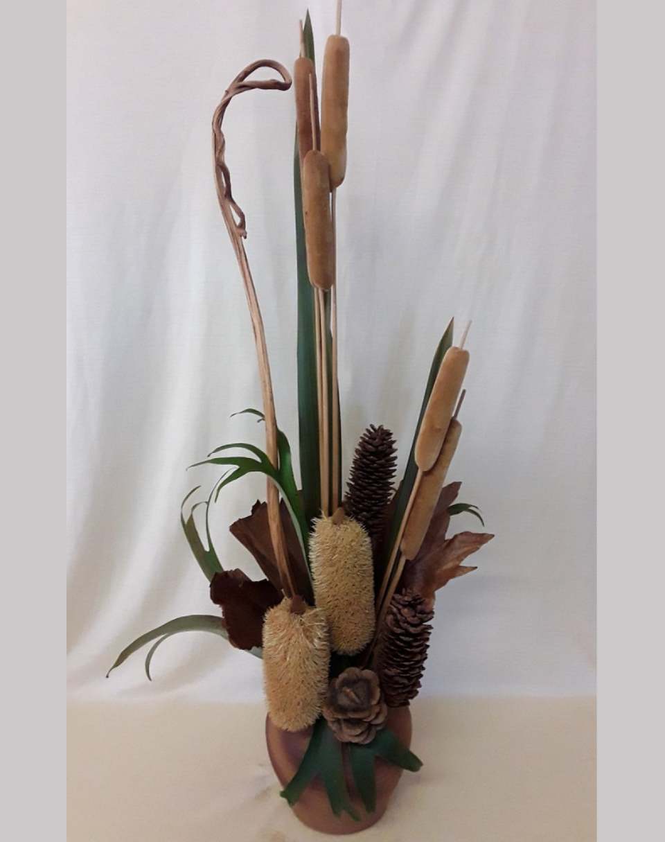
Marlene responded to the earthy, stonelike texture of this vase with heavy groupings of Banksias in the bottom and then taller groupings of bull rushes and flax, and a secondary grouping of bull rushes.
It was good to see the exploration and see the thinking about what was and wasn't working along the way. I think the final result shows some good decisions, particularly the decision to edit some material out, making the design simpler and stronger overall.
Predominantly, the materials, especially the longer materials, are worked in a radial fashion and they come to one radial point which is inside the container.
Contrasting with that are two parallel stems of Banksia, which is often their natural growth habit. That parallelism offers you a contrast and therefore attention to the radial system, creating tension that is being used to create an area of dominance or an area of interest where it's needed.
-

Container Analysis - Texture (Mark)
Looking at the texture of this container, I was aware that it is fairly smooth, but it feels more textured because of its form overall.
So it's not just the the actual physical texture but the visible form that makes it feel undulating.
So I first of all wanted to work with corrugated cardboard because I thought that the texture of the cardboard would align with the lines and texture that appear in the container. I didn’t have what I needed at hand so I settled on sandpaper, in a similar colour, but with distinctly different textures.
-

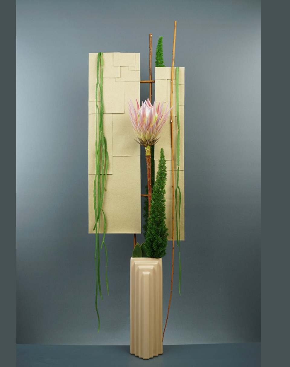
Example Design - Texture (Mark)
Uneven panels tiled in sandpaper repeat the overall shape of the vase while contrasting with its smooth surface.
A grouping of Asparagus Myeri around the base of a single King Protea builds visual weight and density to the right side while an upturned stick stretching from the highest point to the lowest repeats the downward lines of several lengths of rhipsalis as well as the parallel edges of the panels and of the container as well. The rhipsalis provided another smooth glossy texture which repeated the texture of the container, but in a different colour.
Shifting the King Protea a little more to the right would make its placement less central would work in better with the design's decidedly asymmetrical visual balance.
Plenty of examples are provided for insipration and guidance:
Your Container + Form from a One Container, Five Elements session
-

Container Analysis - Form (Kirsten, Participant)
- Symmetrical in all ways - around a central vertical axis.
- Upward tapering form, with dominant visual weight, stablised by a foot/base that taperes out as it moves down.
- Low contrast between height and width. Depth is shallower than other dimensions.
- Feels classical with a modernist/contemporary edge.
-

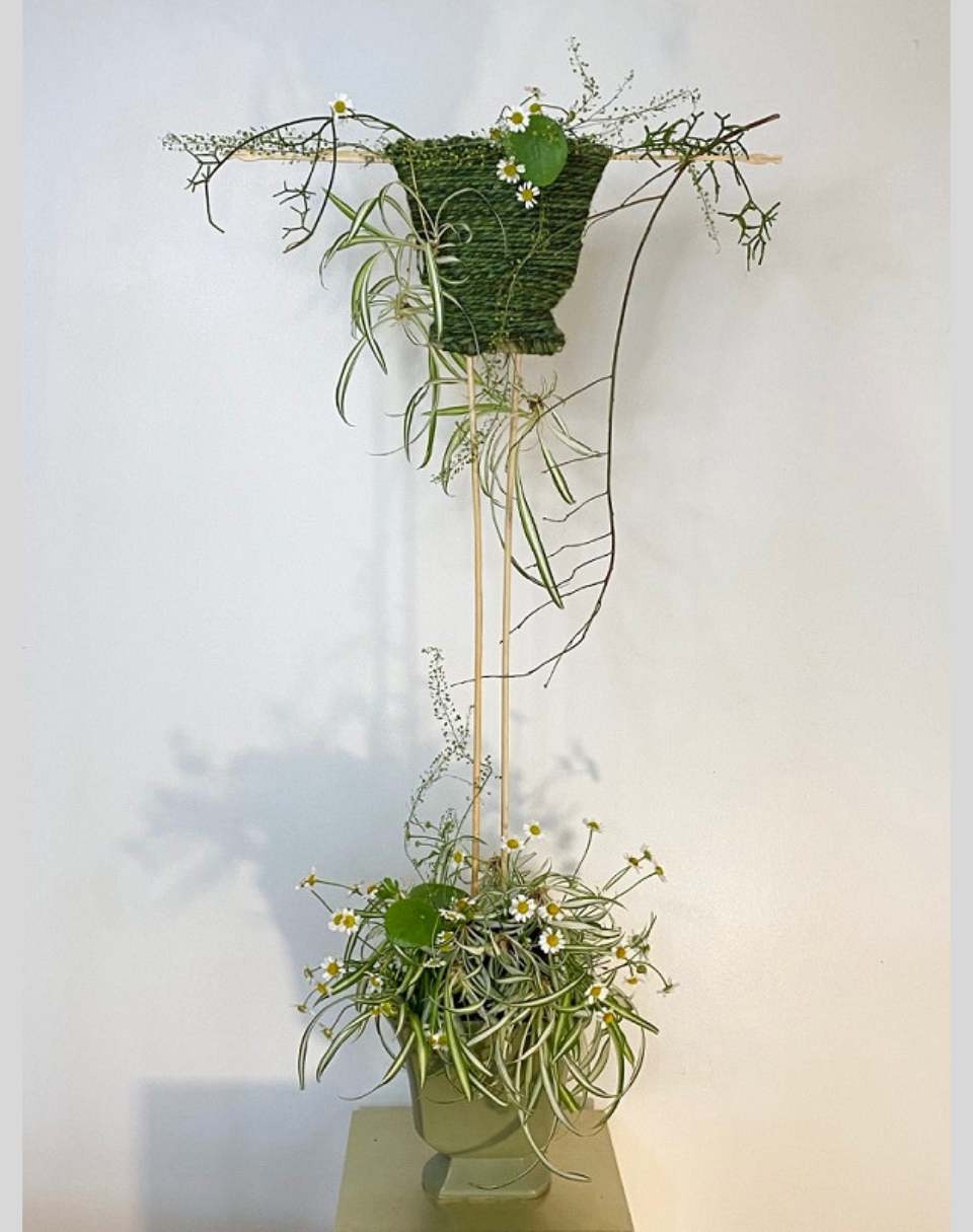
Example Design - Form (Kirsten, Participant)
The immediate repetition of the form of the container in the structure gives the composition an immediate relationship between the container and the design. The outline of the structure at the top mirrors the form of the container at the bottom, so there's an immediate visual connection between the two. There's a lot that is working here, particularly with that connection between the form of the container and the form of the panel at the top and also the delicate lines that swirl through the design and help lead the eye. It's consistently symmetrical, so clear decisions have been made about the visual outline of the design and also clear decisions about the dimensions. So there's a lot of consideration gone into the starting parameters of that design.
-

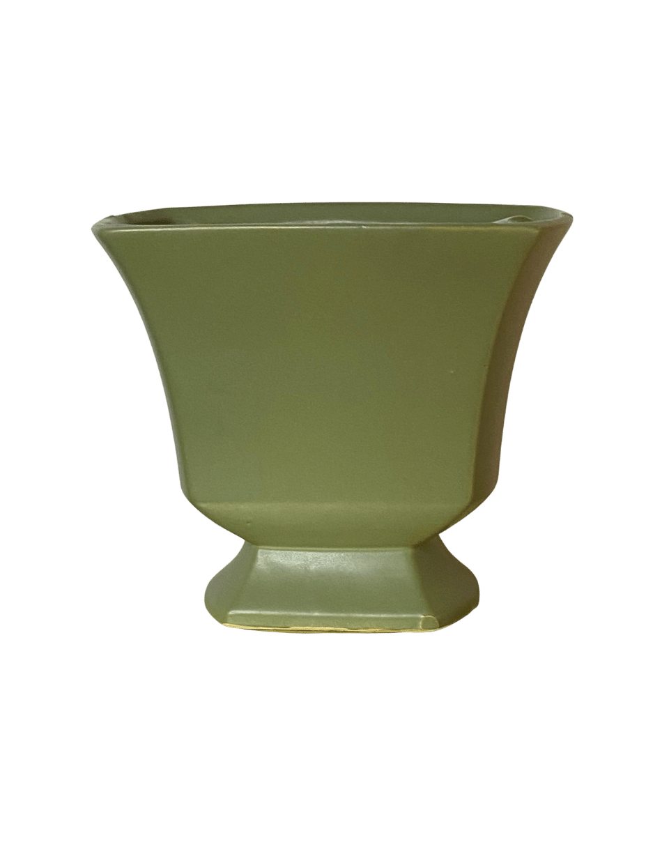
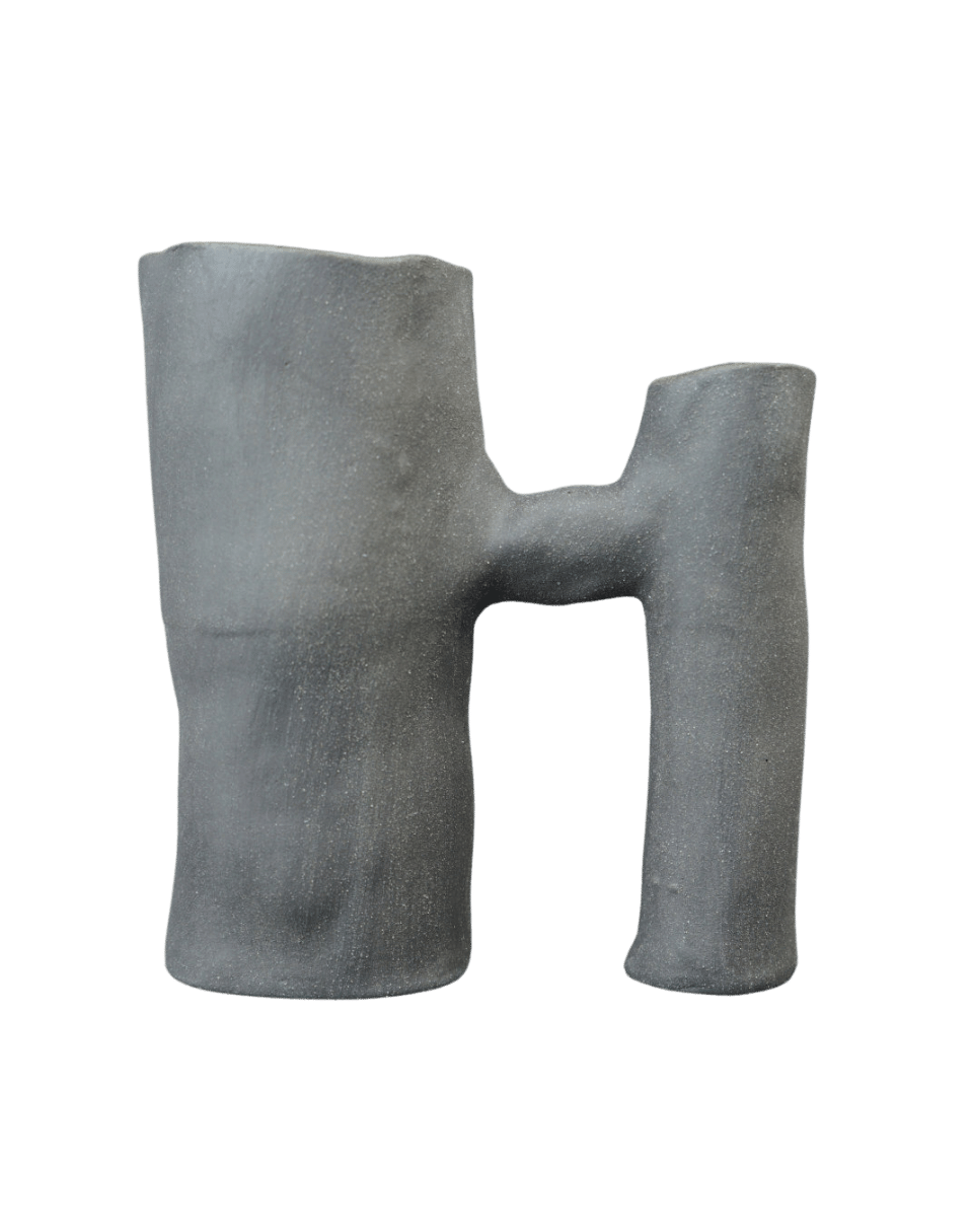
Container Analysis - Form (Mark)
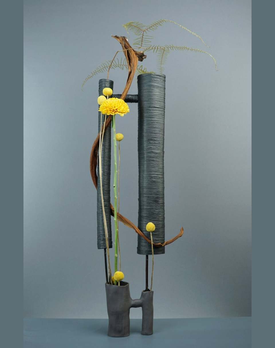
Compound form of three cylinders of different sizes, two larger ones of equal height and unequal diameter joined by a short horizontal cylinder.
Container is assymetrical, having no central vertical axis.
The horizontal cylinder is placed closer to the top than to the bottom, allowing negative space between the verticals.
Not purely geometrical in form due to the hand formed textural characteristics of the components.
-

Example Design - Form (Mark)
I chose to repeat the form of the design of the form of this container but to make it larger and to stretch the proportions a little bit, and reversed them. So in the bottom, the large tube or the large pipe is on the left hand side and the small one on the right hand and I did the opposite in the top there. I worked around it with only a few materials making one really strong focal grouping towards the top of the base right at the point where the horizontal bar connects to the small vertical tube on the left hand side. So that I was using that natural tension point of the joint to help lead the eye to that area. I worked over the top of it with the large Chrysanthemum and the two disbuds, then also ran Philodendron Cataphyll through that area. So that they're all acting together to help lead the home to the design at that point. And then dispersed the other materials around the design. unevenly to help lead the way through.
Your Container + Space from a One Container, Five Elements session
-

Container Analysis - Space (Kath, Participant)
- Vase is solid mass (positive space)
- Gradual tapering from 1/3 down avoids heavy base
- Open space all around
-

Design Example - Space (Kath, Participant)
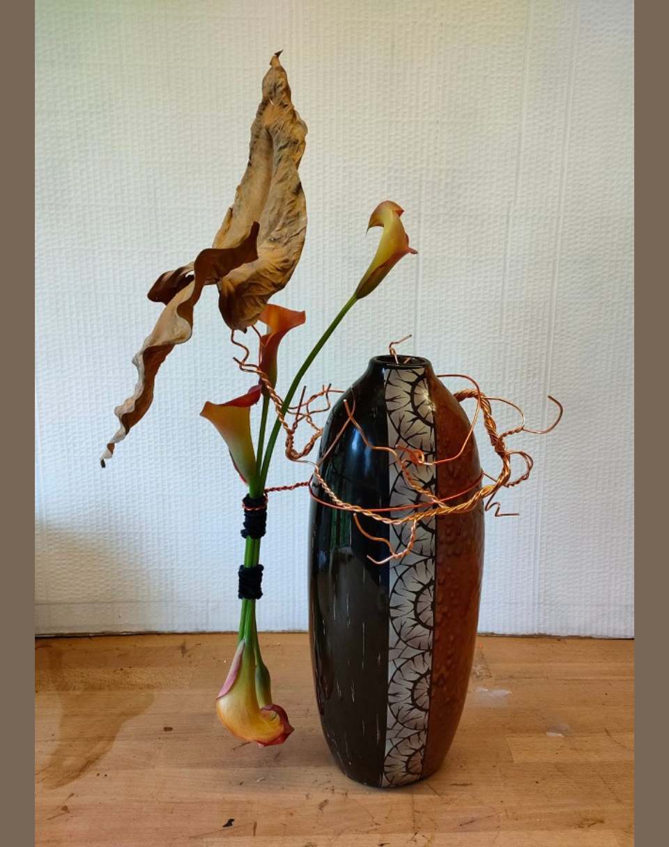
The botanical component of the design occupies a much greater space than the container, giving a really strong contrast between the height and the width. And here, the relationship between the form and the silhouette of the Callas relate to each other immediately... But again, I think it's the proportions could be worked on a little bit. So the proportion of the container to that of the botanicals, and maybe making one larger or one smaller might make it successful overall. There's a good connection here, between the vase and the botanical materials through the mechanics - they embrace the vase and include it as part of the whole design. So you get this visual connection, but also physical connection that joins the two sides together. So it reduces the impact of the bars a little bit whilst you can still clearly see the majority of its form.
-

Container Analysis - Space (Mark)
This vase feels like it is about positive space.
-

Example Design - Form (Mark)
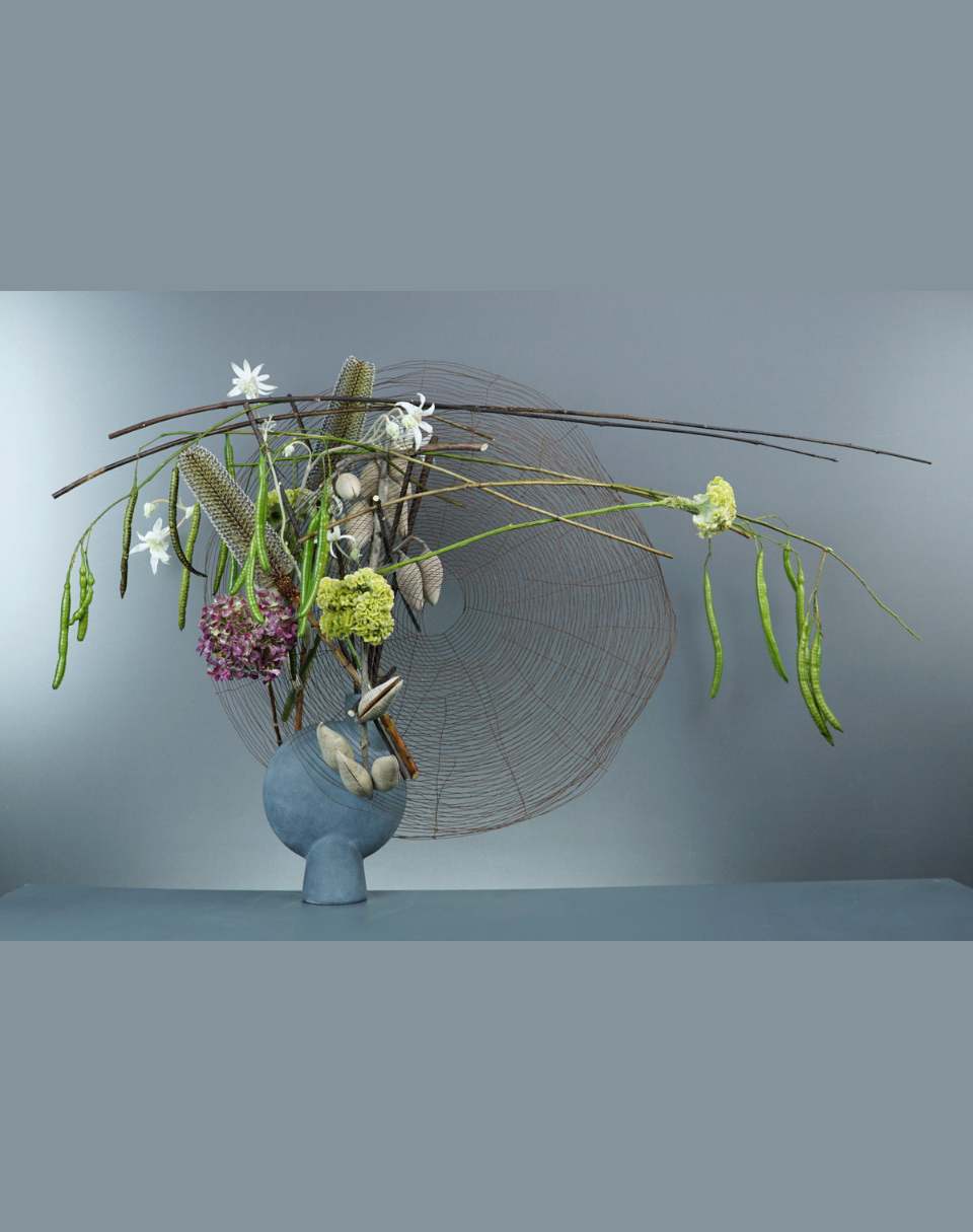
This concrete vase, technically, was a challenge. I decided to contrast against form of positive space of the container, particularly because it looks like it's made of a heavy material, concrete...and to work with very transparent forms, those big tatami reels or discs that are made of very thin wire, creating an interplay between the negative spaces in the discs and the positive space of the vase... the relationship between the two of them being they're both kinds of round forms.
You can see I've worked hard at trying to create areas of density and areas of openness, I have an uneven distribution of material to make it more interesting for the eye to look through the design.
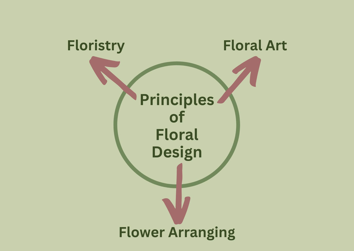
Design Learnings in the Real World
As the focus of One Container, Five Elements is on the Elements and Principles of design, the learnings can be readily applied to the many worlds of flowers – retail floristry, floral art, event design, flower arranging and floral styling.
One Container, Five Elements Timetable
One Container Five Elements is being offered in two classes in 2026, one at a time suited to participants in the US/Canada/Americas and the other in a time zone suited to Australia/NZ/Asia Pacific residents.
If you'd like to participate in this course at a time suited to the part of the world where you live, get together with a group of floral creatives (minimum of five participants) and reach out to me so we can offer class times that work for you.
2026 - USA/Canada/AmericasOnline Introduction Meeting #1 - Monday 13 April 2026, 7:30pm (Washington DC) Subsequent Online Discussions Meeting #2 - Monday 27 April 2026, 7:30pm (Washington DC)
Meeting #3 - Monday 18 May 2026, 7:30pm (Washington DC)
Meeting #4 - Monday 8 June 2026, 7:30pm (Washington DC)
Meeting #5 - Monday 29 June 2026, 7:30pm (Washington DC)
Meeting #6 - Monday 20 July 2026, 7:30pm (Washington DC)
Times All times listed above are for Washington DC. |
2026 - Australia/NZ/Asia PacificOnline Introduction Meeting #1 - Tuesday 14 April 2026, 6:00pm (Sydney) Subsequent Online Discussions Meeting #2 - Tuesday 28 April 2026, 6:00pm (Sydney)
Meeting #3 - Tuesday 19 May 2026, 6:00pm (Sydney)
Meeting #4 - Tuesday 9 June 2026, 6:00pm (Sydney)
Meeting #5 - Tuesday 30 June 2026, 6:00pm (Sydney)
Meeting #6 - Tuesday 21 July 2026, 6:00pm (Sydney)
Times All times listed above are Australian Eastern Standard Time (AEST - Sydney). |
If you'd like to participate in this course at a time suited to the part of the world where you live, get together with a group of floral creatives (minimum of five participants) and reach out to me so we can offer class times that work for you.
Participation Guide
The Participation Guide is your guide to getting the most out of your participation in the One Container, Five Elements program.
If you have questions about One Container, Five Elements, some answers may be found in it, and you are also welcome to ask us any question directly.
Mark Pampling has been designing, competing, teaching and judging for thirty years now and is as well known for his clear, linear design style as for his patient and inclusive way of sharing his knowledge.
- 2019 Beijing World Flower Art Contest – Champion
- 2015 Interflora World Cup, Berlin – Judge
- 2014 Fusion Flowers International Designer of the Year – 1st Place
- 9th China International Orchid Show (Sanya) – Best Creative Award
- 2014 International Flower Contest Japan – Best in Show, Gold Award and Design Innovation Award
- Asia Cup 2014 (Japan) – 1st Place – Surprise Table Display
- 2013 Fusion Flowers International Designer of the Year – 2 Silver Awards & 1 Bronze Award
- 2012 Fusion Flowers International Designer of the Year – 4th Place
- 2012 Interflora Australia Cup – Winner
- 2011 Interflora Australia Cup – Winner
- Australian Competitor 10th Interflora World Cup 2004 – 3rd Place
You can learn more about Mark here.
Flower Thinking
Select one container and create five compositions with it, each with a spotlight on one element of design and the various possible relationships between the chosen container and the elements. Tasks are followed by online discussions which can be joined live and/or watched again later. Tasks and discussions are spaced over an approximately five month period and encourage individual expression, creativity and resourcefulness.
The program timetable and detailed information on how to participate can be found in the Participation Guide.
Couldn't load pickup availability
Share


Let customers speak for us
from 80 reviewsThe intriguing theme,"Uncommon threads", captured my attention and thinking. I initially thought this short course,"Designing to win", would be too challenging. I found that it was actually comprehensive, well organized and structured, and rewarding eventually. This course was about understanding the rules and schedule of a competition. It was about learning how to evaluate one's design for a competition against an essential list of marking criteria for judging. Mark conducted two virtual discussion forums fluently, meticulously and constructively by giving clear analysis with concise explanations. He posed questions and made suggestions on each participant's design in #1 submission. The task of improving/adjusting/changing in order to achieve a better outcome became the necessary challenge for #2 submission.
The learnings from all the other submissions was just as important as those of mine. After having completed this course, I gained a better understanding of the entire process of designing to win and the crucial decision making that hinged on the points/marks for judging. The "wow factor" which can contribute to winning can be achieved by more critical evaluation of a design. Learning to be a better designer is always my aim in participating in Mark's courses. I truly felt that I achieved it and it was a likely "win" for me. The instructional eBooks and video tutorials on competitions were valuable bonuses given after completion of the course.
Thank you, Mark, for this great opportunity to learn from you.
One Container, Five Elements expanded my design processes and choices. Analysing the container and looking for a link to each of the five elements. Focusing on one element was a disciplined journey, one that became more complex the further I travelled along the path, albeit a rewarding journey. On reflection it allowed me to consider my choices and to give each element of design a voice in my arrangements. I likened it to a choir where one voice may lead but if the supporting harmonies are not in pitch the whole auditory experience is not quite right. I found myself falling to my favourite elements and constantly self-evaluating to see what was often needed, often editing rather than adding. During the group feedback sessions, I gained new eyes not only on my own work but that of my peers. Such a rewarding experience.
Each task or assignment for this course pushes you to think more about placement of components in order to ensure that the elements and principles of design are used to create a harmonious result. Mark encourages creativity by providing examples before leaving you to work in your own way, this is incredibly stimulating. All feedback provided is done in a positive way which encourages you to assess your own work better each time - however I still manage to repeat some of the same faults over and again ;) so plenty more to learn.
I really enjoyed the course and particularly found the critique process really helpful, as Mark carefully explained what worked well with the designs we had each produced and how they could potentially be improved further. At each stage, Mark explained how the design principles applied and helped me to develop my understanding of contemporary work.
Yet another amazing floral learning opportunity by our incredible Mark Pampling and Flower Thinking. The experience of learning is outstanding with endless learning opportunities. This is not simply an online course, it is an interactive extremely detailed, deep learning opportunity. Thank you Flower Thinking - My designs from the course are pictured below. So much learning and adaptation creates a new awareness and thought process in design which I truly enjoyed.
Festive Thinking allowed me to expand my creativity. Mark’s ebooks and video explanations were clear and provided examples of the task. I throughly enjoyed creating with the sickles and the online forum. Mark expert advice and suggestions gives insights into the designer’s arrangements. This allows for self improvement and reflection on my own creation. A wonderful experience I look forward to the next Flower Thinking offering.
