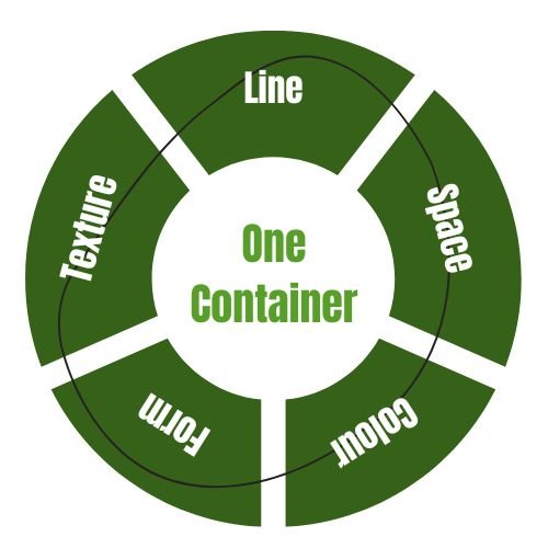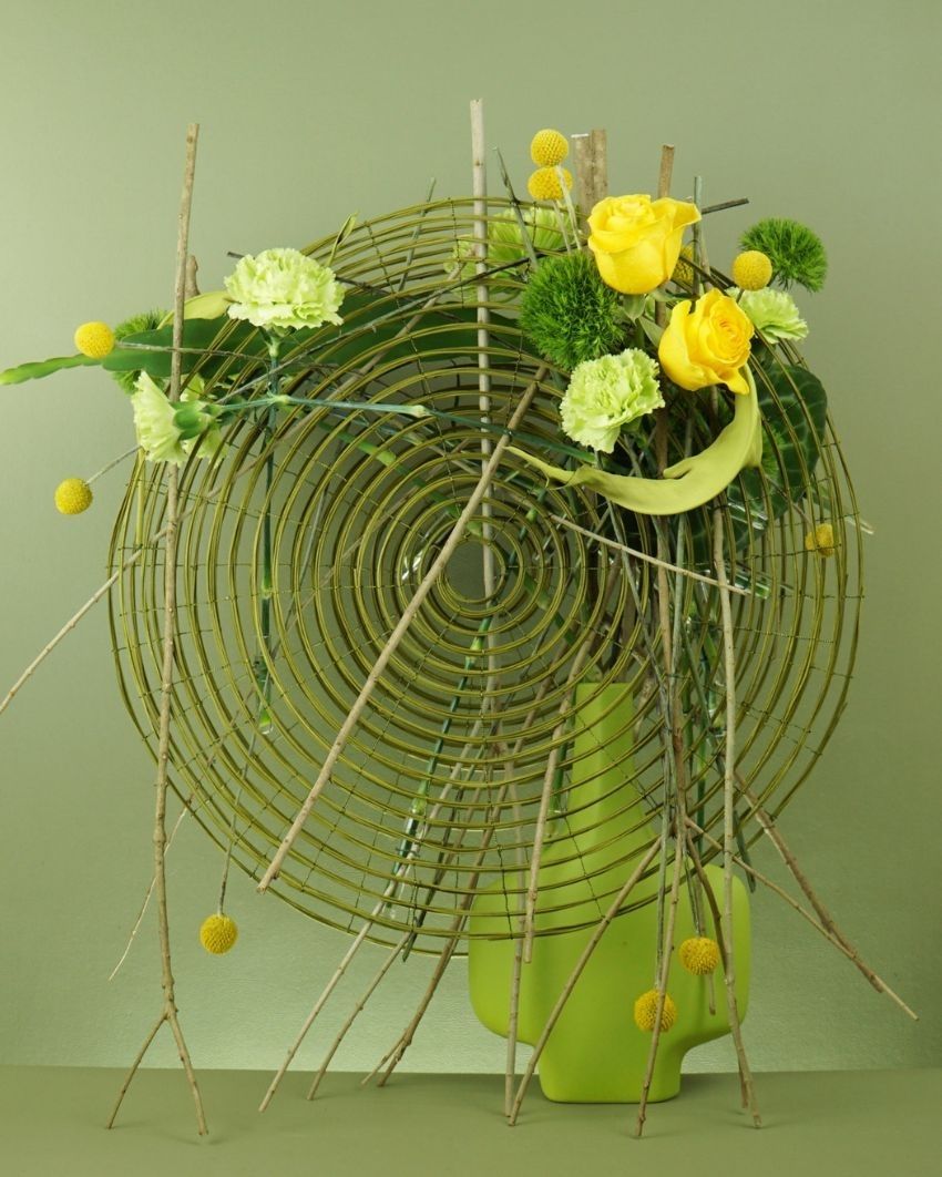


One Container, Five Elements
See Course Dates
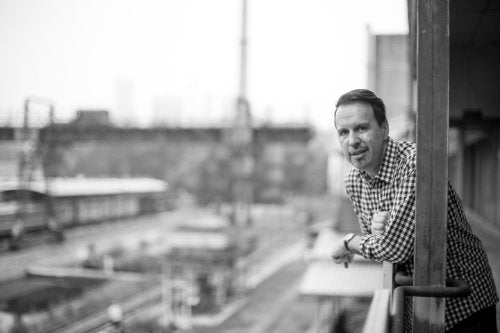
Led by Mark Pampling, Master Florist
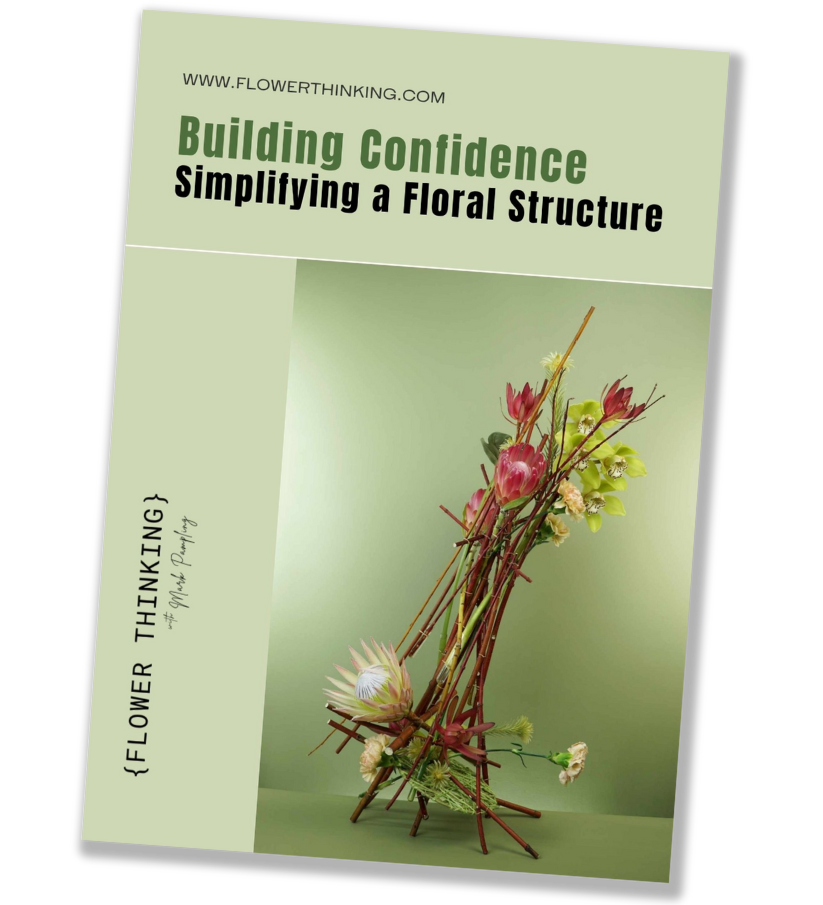
An online course in five practical tasks and six online sessions
Understand what makes your designs work when they do, and what is missing when they don't.
Over six sessions, we'll close the gap between intuition and understanding, building a set of analytical habits that let us examine a design and say with some precision what is happening in it and why.
We'll come away with stronger skills we can apply to any brief, design or material.

Line
Before anything else, we look at what lines we can see in the container. Physical lines - curves, straight lines, parallels - and implied ones, too.
We notice how those lines are organised, and where the container's energy seems to move.
Then we respond: repeating a line system, contrasting it, extending it, or following the direction the container has set.

Colour
We start with the colours already present, and with the less obvious question of how strongly they speak.
A matte black, for example, reads differently from a glossy one, an earthy brown differently beside a cooler one.
From there we decide whether our reading of the container's colour is a starting point to extend, a neutral ground to work against, or something we must answer with deliberate contrast.

Texture
Texture is felt by the eye as much as by the hand. A smooth, polished surface amplifies colour and form; a rough or matte one subdues them.
We examine the container's textural character - its consistency, its grain, its relationship to light - and then consider how the materials we place near it will converse with it.
Texture rarely asks for repetition. More often it asks for a considered contrast, or a quiet echo.

Form
Form is the container's silhouette, its proportions, its presence in space. We analyse it as shape: is it symmetrical or asymmetrical, geometric or organic, does it have a dominant axis?
Then we decide how to respond - to mirror or extend it, to answer it with a contrasting silhouette, or to make it part of a larger formal statement.
Whatever decision we make, it is intentional.

Space
Space is the Element most designers reach last, and the one that most rewards careful analysis. We consider the container as something that shapes space as much as occupies it: where the space around it feels captured, and where it feels open.
We work with that, using density, transparency, grouping and separation, to make Space a deliberate part of the composition, rather than "what is leftover".

This course is for floral designers and artists who have reached a point where they want to understand their own work more clearly.
Not necessarily to design differently, but to understand what makes their designs work when they do, and what is missing when they don't.

Some participants have been competing and teaching for decades, while others are at the beginning of a serious engagement with design.
What they have in common is a willingness to look analytically at their own work, to carefully consider feedback, and to give a task the time it needs - rather than the time it would take if hurried.
What shapes this course is Mark' conviction that the most transformative thing a designer can learn is not a new technique or a style, but how the fundamental Elements of design interact, and how to analyse one's own work through them.
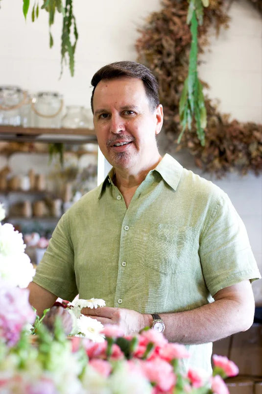
Mark Pampling has been designing, competing, teaching and judging for thirty years now and is as well known for his clear, linear design style as for his patient and inclusive way of sharing his knowledge.
- 2019 Beijing World Flower Art Contest – Champion
- 2015 Interflora World Cup, Berlin – Judge
- 2014 Fusion Flowers International Designer of the Year – 1st Place
- 9th China International Orchid Show (Sanya) – Best Creative Award
- 2014 International Flower Contest Japan – Best in Show, Gold Award and Design Innovation Award
- Asia Cup 2014 (Japan) – 1st Place – Surprise Table Display
- 2013 Fusion Flowers International Designer of the Year – 2 Silver Awards & 1 Bronze Award
- 2012 Fusion Flowers International Designer of the Year – 4th Place
- 2012 Interflora Australia Cup – Winner
- 2011 Interflora Australia Cup – Winner
- Australian Competitor 10th Interflora World Cup 2004 – 3rd Place
More about Mark here.